부모상자의 위치는 포지션, 다른것들과 어울려야한다.
자식상자 위치는고정
287
◐test7
<!DOCTYPE html>
<html lang="en">
<head>
<meta charset="UTF-8">
<meta name="viewport" content="width=device-width, initial-scale=1.0">
<title>Document</title>
<link href="../css/reset.css" rel="stylesheet"/>
<link href="../css/basic.css" rel="stylesheet"/>
<style>
/* position 연습 */
/* 부모는 반드시 width와 height값을 가진다, relative */
.parentBox{
position: relative;
width : 100%;
height: 400px;
/*3가지 기본*/
/* relative 흘러가는대로, 그러나 static과 자식들의 위치가 다르다*/
/* fixed 고정값 */
background-color: azure;
}
/* 자식 : 부모 요소 안에서 배치, 부모 상자안에서 위치를 설정
absolute
*/
h1.childBox1, div.childBox2, div.childBox3{ /* childBox1,childBox2,childBox3*/
width: 200px;
height: 100px;
margin: 0; padding: 0; /*이미 reset.css에서 처리해서 생략가능 */
border: 1px solid black;
position:absolute; /* 자식 요소 */
}
h1.childBox1{
top:0;
left:30px;
}
div.childBox2{
top: 10px;
right: 20px;
}
div.childBox3{
left : 250px;
bottom: 0;
}
/* 그냥 상자 */
#friend{
box-sizing: border-box;
/* box-sizing: content-box; 글씨영역 */
width: 100%;
height: 300px;
background-color: blueviolet;
}
</style>
</head>
<body>
<div class ="parentBox">
<h1 class="childBox1">
자식1
</h1>
<div class="childBox2">
자식2
</div>
<div class="childBox3">
자식3
</div>
</div>
<div id="friend">
<h1>친구 상자</h1>
</div>
</body>
</html>
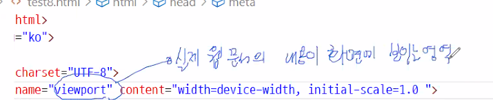
◐test8
<!DOCTYPE html>
<html lang="en">
<head>
<meta charset="UTF-8">
<meta name="viewport" content="width=device-width, initial-scale=1.0">
<title>Document</title>
<link href="../css/reset.css" rel="stylesheet" />
<link href="../css/basic.css" rel="stylesheet" />
<style>
div.wrap{
width: 100%; /*반응형으로 설정*/
height: 100vh;
}
.header{
width:100%;
height: 200px;
background-color: aquamarine;
}
.container{
width:100%;
height: 500px;
overflow: hidden; /*부모요소에다가 필수로 준다.*/
/*자식 요소에 float속성을 사용할 경우 */
}
.left{
width: 200px;
height: 500px;
margin-right: 10px;
background-color: bisque;
float: left; /*자식요소에 float을 넣어줌*/
}
.right{
float: left; /*자식요소에 float을 넣어줌*/
width: 750px;
height: 500px;
background-color: blueviolet;
}
.footer{
width: 100%;
height: 100px;
background-color: azure;
}
</style>
</head>
<body>
<div class="wrap">
<header class="header">
<dvi>머리말</dvi>
</header>
<div class="container">
<section class="left">
<h1>왼쪽</h1>
</section>
<section class="right">
<h1>오른쪽</h1>
</section>
</div>
<footer class="footer">
<h1>회사소개</h1>
</footer>
</div>
</body>
</html>
부모 : overfloat : hidden;
clear:both
floot:left
floot:right
#부트스트랩
부트스트랩 무료 템플릿입력

참고해서 나한테 필요한 부분만 가져와서 쓴다.
#w3scholls

#
- 각종공부
#
- how to - 소스코드 긁어오기(그대로 말고, 내가 필요한것을 가져와서 수정)
-디자인…
login
checkbox
slideshow
#
w3schools - bootstrap 4버전
2가지
1)다운로드
2)연결방법
Bootstrap 4 CDN
스타일시트만 쓸때
복붙해서 사용
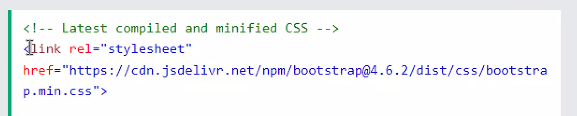
# https://getbootstrap.com/docs/4.6/components/card/

◐boot.html
<!DOCTYPE html>
<html lang="en">
<head>
<meta charset="UTF-8">
<meta name="viewport" content="width=device-width, initial-scale=1.0">
<title>Document</title>
<link rel="stylesheet" href="https://cdn.jsdelivr.net/npm/bootstrap@4.6.2/dist/css/bootstrap.min.css" integrity="sha384-xOolHFLEh07PJGoPkLv1IbcEPTNtaed2xpHsD9ESMhqIYd0nLMwNLD69Npy4HI+N" crossorigin="anonymous">
<script src="https://cdn.jsdelivr.net/npm/jquery@3.5.1/dist/jquery.slim.min.js" integrity="sha384-DfXdz2htPH0lsSSs5nCTpuj/zy4C+OGpamoFVy38MVBnE+IbbVYUew+OrCXaRkfj" crossorigin="anonymous"></script>
<script src="https://cdn.jsdelivr.net/npm/bootstrap@4.6.2/dist/js/bootstrap.bundle.min.js" integrity="sha384-Fy6S3B9q64WdZWQUiU+q4/2Lc9npb8tCaSX9FK7E8HnRr0Jz8D6OP9dO5Vg3Q9ct" crossorigin="anonymous"></script>
<!-- css -->
<link rel="stylesheet" href="https://stackpath.bootstrapcdn.com/bootstrap/4.3.1/css/bootstrap.min.css" integrity="sha384-ggOyR0iXCbMQv3Xipma34MD+dH/1fQ784/j6cY/iJTQUOhcWr7x9JvoRxT2MZw1T" crossorigin="anonymous">
<!-- javascript, jquery, popper.js-->
<script src="https://code.jquery.com/jquery-3.3.1.slim.min.js" integrity="sha384-q8i/X+965DzO0rT7abK41JStQIAqVgRVzpbzo5smXKp4YfRvH+8abtTE1Pi6jizo" crossorigin="anonymous"></script>
<script src="https://cdnjs.cloudflare.com/ajax/libs/popper.js/1.14.7/umd/popper.min.js" integrity="sha384-UO2eT0CpHqdSJQ6hJty5KVphtPhzWj9WO1clHTMGa3JDZwrnQq4sF86dIHNDz0W1" crossorigin="anonymous"></script>
<script src="https://stackpath.bootstrapcdn.com/bootstrap/4.3.1/js/bootstrap.min.js" integrity="sha384-JjSmVgyd0p3pXB1rRibZUAYoIIy6OrQ6VrjIEaFf/nJGzIxFDsf4x0xIM+B07jRM" crossorigin="anonymous"></script>
</head>
<body>
<div class="row">
<div class="col-sm-3 display-1">.col-sm-3</div>
<div class="col-sm-3">.col-sm-3</div>
<div class="col-sm-3">.col-sm-3</div>
<div class="col-sm-3">.col-sm-3</div>
</div>
<button type="button" class="btn btn-success ">Success</button>
<h2>사원카드</h2>
<div class="card">
<div class="card-body">홍길동</div>
</div>
<form action="/action_page.php">
<div class="form-group">
<label for="email">Email address:</label>
<input type="email" class="form-control" placeholder="Enter email" id="email">
</div>
<div class="form-group">
<label for="pwd">Password:</label>
<input type="password" class="form-control" placeholder="Enter password" id="pwd">
</div>
<div class="form-group form-check">
<label class="form-check-label">
<input class="form-check-input" type="checkbox"> Remember me
</label>
</div>
<button type="submit" class="btn btn-primary">Submit</button>
</form>
<!-- 위로올리면 실행이안된다. 자바스크립트로 바꿔야한다.-->
<style>
.accordion {
background-color: #eee;
color: #444;
cursor: pointer;
padding: 18px;
width: 100%;
border: none;
text-align: left;
outline: none;
font-size: 15px;
transition: 0.4s;
}
.active, .accordion:hover {
background-color: #ccc;
}
.panel {
padding: 0 18px;
display: none;
background-color: white;
overflow: hidden;
}
</style>
<h2>Accordion</h2>
<button class="accordion">Section 1</button>
<div class="panel">
<p>Lorem ipsum dolor sit amet, consectetur adipisicing elit, sed do eiusmod tempor incididunt ut labore et dolore magna aliqua. Ut enim ad minim veniam, quis nostrud exercitation ullamco laboris nisi ut aliquip ex ea commodo consequat.</p>
</div>
<button class="accordion">Section 2</button>
<div class="panel">
<p>Lorem ipsum dolor sit amet, consectetur adipisicing elit, sed do eiusmod tempor incididunt ut labore et dolore magna aliqua. Ut enim ad minim veniam, quis nostrud exercitation ullamco laboris nisi ut aliquip ex ea commodo consequat.</p>
</div>
<button class="accordion">Section 3</button>
<div class="panel">
<p>Lorem ipsum dolor sit amet, consectetur adipisicing elit, sed do eiusmod tempor incididunt ut labore et dolore magna aliqua. Ut enim ad minim veniam, quis nostrud exercitation ullamco laboris nisi ut aliquip ex ea commodo consequat.</p>
</div>
<script>
var acc = document.getElementsByClassName("accordion");
var i;
for (i = 0; i < acc.length; i++) {
acc[i].addEventListener("click", function() {
this.classList.toggle("active");
var panel = this.nextElementSibling;
if (panel.style.display === "block") {
panel.style.display = "none";
} else {
panel.style.display = "block";
}
});
}
</script>
</body>
</html>
사용법
<!-- css -->
<!-- javascript, jquery, popper.js-->

이거추가
그다음

#grid

그리드 방식 : span12개로 나눈다 보통은

ex) sm이라는것은 크기

12개 = 3개로 묶었다.

이크기에 4개,8개로 사용한다.
# 그다음 컬러

ㅡㅡ

samll
bg 배경색
primary - 하늘색
display - 보여지는모습

btn-success : btn버튼의 색상
text-info : 글자의 색상

form-check 체크상자사용
input태그사용
placeholder - 해설
P - padiing
m - margin
w - width
h - height
mw - margin width
#반응형
모든페이지를 반응형으로 작업
대표적 크기 잡는 것
3개기종정도 구현? > 3가지코드가 나와야한다.
스타일싯트만 바꾸는 것
스마트폰 1)
데스크탑 2)
바디는 똑같이, css로 바꾸기.
계산기로 계산 - 스토리보드(전체크기) ex)960, 1200px 기준으로 퍼센테이지 나눈다.
자기를 감싸고있는 것이 부모
자식으로 쓰고싶어하는 부모전체상자 크기로 자식의크기를 나누고 *100 = 퍼센트
소숫점2~3자리까찌만 맞추면된다.(대략적으로)
부모크기, 자식크기 대략적으로 만들어져있어야한다. 반응형
마진,패딩 - %
ㅡ 최대한 줄여보기(정하기)
ㅡ 최대한 늘여보기
#
계산해주는 사이트
#
p391 반응형 웹페이지
vw 1vw=1%
vh 1vh=1%
vmin
vmax
p395
% =>
가변 크기의 %값 중 너비 =
(가변 크기를 만들 박스의 크기 ‘나누기’
가변크기로 만들 박스를 감싸고있는 박스의 가로 너비(부모) * 100)
요소도 padding, margin도 다 계산해서 %로 지정해야 함
width : calc(100%-100px);
글자 크기 단위 : px, pt, … 고정의 개념
1em = 16px
em = 글자 크기(px) / 16px
가변글자크기 =
(가변폰트를 적용할 글자 크기 / 적용할 요소를 감싸고 있는 요소의 글자크기)
*최신 브라우저는 픽셀 단위를 사용해도 축소, 확대가 가능
(예전 브라우저는 그렇지 않습니다.)
rem단위 : r-root
처음부터 기본 크기를 지정하기 때문에 중간에 기본 값이 바뀌지 않음
html{
font-size: 크기 px;
}
vw : (viweport width) :
(vw단위를 적용할 글자 크기 * 브라우저의 너비) / 100
5vw, 웹 브라우저의 너비가 1280px
(5*1280)/100 = 64px
#미디어쿼리
p395

=================================================
@media [only | not] 미디어유형 [and 조건 and 조건]{
스타일시트 작성
}
p396
only - 미디어 쿼리를 지원하지 않는 웹브라우저는 무시하고 실행
미디어 쿼리를 지원하는 웹브라우저에서만 조건을 인식(실행)
not - not 다음에 지정한 미디어 유형을 제외
and - 조건을 계속 추가
, 쉼표(콤마) - 동일한 스타일 유형을 사용할 미디어의 유형과 조건이 있다면
쉼표를 이용해 추가
@media A and B{실행문} : A와 B 모두 true이면 B에 맞춰 해석
@media A, B{실행문} : A와 B둘중 하나만 만족허달도 B에 맞춰 해석
<미디어 유형>
all - 모든 미디어 유형
print - 인쇄장치
screen - 컴퓨터 또는 스마트폰
tv - 음성과 영상이 동시 출력되는 tv
@media screen and(min-width : 768px) and (max-width:1200px){ }

760~1200 크기만큼 적용되는 것
@media screen and(min-width : 1440px){ }
#
divice들어가면 단말장치,
@media screen and(min-device-width : 768px) and (max-device-width:1200px){ }
@media screen and(min-device-width : 1440px){ }
(and 쓸때 한칸 띄워야한다.)

<외부 미디어 쿼리>
<link rel=”stylesheet” media=”미디어 쿼리 조건” href=”css파일경로”>
<link rel=”stylesheet” media=”screen (min-width:768px) and (max-width:1200px) “ href=”./css/test.css”>
# max와 min( 미디어쿼리)

max가 2400이면
그다음 오는 값이 2700이면 안된다. 최대 2400으로먼저 정했따면 그 밑으로 지정해야한다.
min이 1200이면,
그위로 큰 수가 와도 된다.
p404
◐
test9.html
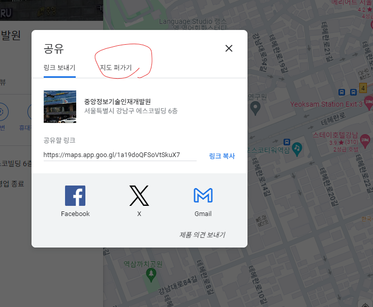
#팝입콘

#구글지도


'4.VisualStudioCode > 2).VisualStudioCode_개념 및 실습' 카테고리의 다른 글
| VisualStudioCode_Day_07 (2) | 2024.02.26 |
|---|---|
| VisualStudioCode_Day_06 (1) | 2024.02.23 |
| VisualStudioCode_Day_04 (0) | 2024.02.21 |
| VisualStudioCode_Day_03 (1) | 2024.02.21 |
| VisualStudioCode_Day_02 (0) | 2024.02.21 |